The 3 Visual Assets You Need to Build A Consistent Brand
By Kiana Denlinger | July 8, 2015
If you’re starting or growing a business, you’re probably focused on product development, sales models and company culture. Whether or not you’re making a conscious effort though, you’re also building a brand.
Everything you do contributes to your brand image and consistency is key. Unfortunately, positive brand recognition doesn’t happen overnight — it takes many different elements coming together. You may not have the bandwidth or money to invest in all of these elements upfront, but that doesn’t mean that you can’t build a firm foundation for your brand.
If you’re like many new or growing businesses, you’ll begin by focusing on the visual aspects of brand development. The tips in this article are meant for those with a logo but without the other basic visual assets necessary for consistent branding. Putting these pieces in place will begin to form a memorable reference point to connect customer experiences with your brand.
 Read this article and use the accompanying checklist to figure out which elements you have in place and which you still need. Any designer worth their salt will be able to get you these items quickly so you can build a consistent visual identity from the start.
By compiling these elements and filling in the gaps, you’ll give your budding young brand a strong visual foundation to lean on while your company grows. With consistent application, they’ll build the brand recognition you need to help your customers connect with your company and understand what you’re all about.
Turn an underperforming in-house creative department into a creative powerhouse!
Must Have #1: A Logo “DO” List
Remember that a logo is more than an aesthetically pleasing work of art—it’s an all-powerful communication tool that spans both culture and language. You need usage guidelines to direct that power.
If you’ve worked with a professional, you should have a set of files when your logo is complete —some labeled EPS or PNG, and some in color or in black and white. You should also ask your designer for a “DO” list that tells your staff and partners which logo variation(s) to use when.
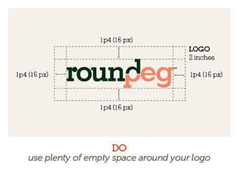
It should specify when to use a full-logo lockup (logomark + logotype) and when it’s okay to use only the logomark (the part of a logo that is an illustration, photo or monogram) or logotype (only type, without any accompanying photo, illustration or monogram). It should also specify when to use all-black, all-white and full-color logo versions and how much blank space should surround your logo. Include this “DO” list of usage guidelines in your visual brand guide so that everyone using the logo, whether in-house or not, is on the same page.
But wait! What about those indistinguishable file names? I mean, YourCompanyName-PMS-Vertical.EPS must be another language, right? Don’t panic — understanding file types is simple once you understand the basics:
- EPS files are for printed materials
- PNG and JPEG files are for digital materials
Include this info in your visual brand guide to make things a little easier for your users. Need help explaining file formats? Download our Guide to File Formats for an explanation of exactly when to use which file formats.
Nice Extra: A “DON’T” List
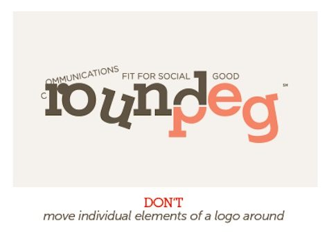 If possible, commission a “DON’T” list as well. It will be a brief list of things that people should not do to your logo – things like inverting/reversing it, changing the fonts or moving parts around. These are all quintessential logo DON’Ts. A designer can form a solid list of DON’Ts that will protect the integrity of your carefully crafted logo. Include the list in your visual brand guide to keep users from doing anything crazy with your logo.
Must Have #2: A Font Family Tree
Your visual brand guide should specify several fonts (2-3) to be used on branded materials. If the question of fonts came up in the logo design process because your logo includes type, you can use those conversations as a jumping off point. If not, get a designer to identify fonts that will work for your brand’s personality.
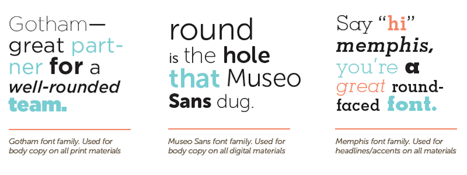
Remember that your fonts should be consistent in all external and internal communications, so it’s smart to request fonts that lend themselves to different uses. Usually each font is given a specific use, like headlines only (often reserved for more elaborate looking fonts) or informational/body copy (for only the most readable fonts). Also make sure you have a web version of the font that developers can use on your site. Often, this is a font with a different name but a very similar look.
Establishing your brand fonts and including them in your guide will help ensure visual consistency for your brand, no matter who’s creating your company’s materials.
Must Have # 3: An Inspiring Palette
If you have a logo, you already know one or two of your brand colors. If it’s a multi-color logo, you know a few! Identify other colors that may also be part of your palette, and put them all on a single page in your guide that everyone can reference.
The page should explain which colors to use when and include the color codes people will need to use the colors – PMS, CMYK and RGB / Hex.
PMS color codes are for print materials, especially high-quality offset printing, and help ensure consistency.
CMYK codes work for any and all print materials, though the hues they produce will vary slightly from printer to printer.
RGB and Hex codes are both for digital applications and the exact hues will vary depending on the calibration of the screen.
I’d recommend starting off with two colors now and then getting a designer to add one or two more later on if necessary. Most brand palettes range from two to six colors and can include lighter or darker variations of a specific hue.
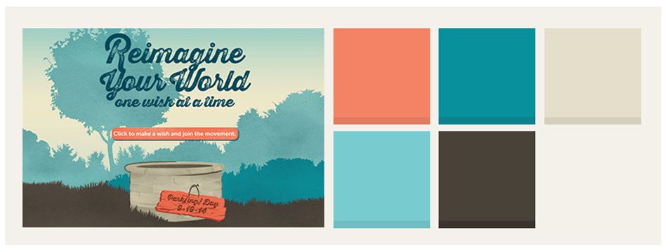
Here’s an application of our brand colors for our Parking Day 2014 campaign.
Compile Your Lists
Compile all of the information you’ve gathered into one accessible visual brand guide. This document will make the details of your brand’s visual identity easily available to employees, future partners and freelancers in need of guidance. As your company grows, you can expand your guide into a more comprehensive document with more specific usage guidelines and templates, as well as other brand elements like brand positioning and personality statements, key messages, writing style guidelines and more.
Taking these simple steps to develop a basic, cohesive visual identity guide will help you maintain a distinctive and powerful visual identity as you grow, which will provide your customers and clients with a memorable reference point for your company’s brand.
But Leave Some Room for Flexibility
It’s worth mentioning that not all brands keep everything consistent all of the time. Take, for example, the much-loved Google Doodles that grace the search engine’s home page every so often. In this case, the branding is consistently inconsistent – the dynamic logo is part of the brand’s innovative personality and its quest to connect people to information. That said, the Doodles certainly look very different each time and don’t adhere to a single style or color palette.

You might get to the point one day where you, too can make your brand more dynamic but for now, just try for consistency. It’s enough of a challenge, and it’s sure to pay off.
Pretty sure you’ve got what you need?
Download the Visual Branding Checklist and Make Sure!
Want to learn more?
Read Growing Your Brand from Bud to Bloom.
Pretty sure you need some help!?
We help organizations re-think how their creative departments function, from overall structure to creative team staffing and training. Learn how time translates into dollars — and how having the right people in the right jobs can turn a underperforming in-house creative department into creative powerhouse. Discover RoundPeg’s Creative Services Management Support: Get More Info!



I’ve been following a RoundPeg for a bit and have found several of RoundPeg blogs incredibly helpful and wanted to say thank you for sharing the wealth.
As a new benefit corporation founder and blogger/outreach consultant for a mission-driven business, RoundPeg’s insights give great starting points and suggestions as I go further in the social entrepreneurship journey. I’ll be sure to send people your way.
Thanks and keep doing good!
Carrie —
Thank you so much for your kind words. Knowing that our advice is helping businesses like Norfolk FairTrade Co is an amazing feeling! Best wishes for a happy holiday season and a wonderful new year ~
Alison + Kiana + The rest of the RoundPeg team